What is Auto Layout?
Auto Layout changes the way that you create your iOS and OS X user interfaces in simple, but powerful ways. Rather than explicitly setting the origin and size of UI elements, you declare constraints between views that describe how UI elements are displayed. Constraints represent the relationship between two user interface elements.
- This view stays a fixed distance from the top.
- This view is the same size as another view.
- This view is centered in the superview.
You create basic user interfaces in Interface Builder without using auto layout by using the familiar “springs and struts” method.
- UI layout is accomplished by specifying the location and size of each element and you specify the resizing behavior of a view relative to its superview.
- The margins for a given view could be a fixed distance to the superview or flexible.
- Width and height of the view could be fixed or scale with the changes to the superview.
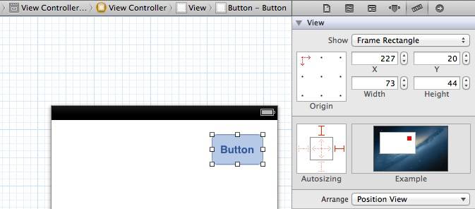
You can turn auto layout off or on in the Interface Builder file inspector for the entire Storyboard or xib file.
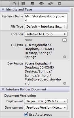
Note: you cannot turn auto layout on and off for a single view; the “unit of currency” (as Mark Dalrymple likes to say. Hi Mark!) is the individual xib or storyboard file.
It has always been fairly easy to use springs and struts to create basic UI that, for example, causes a view to hug the edges of its superview. However, there are many situations that springs and struts don’t handle well. For example, two UI elements that look great in portrait orientation may autosize for landscape orientation in a way that causes them to overlap.
Constraints-based layout in IB
When you turn auto layout on in Interface Builder, the springs and struts UI is replaced by UI that allows you to change the properties of auto layout constraints. With auto layout turned on, you will see UI like this appear.
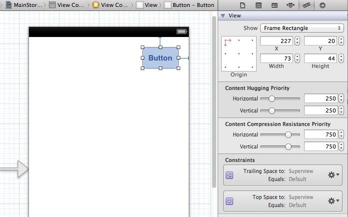
Those thin blue I-beam shaped lines that Interface Builder added represent auto layout constraints. In this case, they constrain the button’s distance relative to the right edge of its superview.
In this tutorial you will use the new auto layout features in Interface Builder to layout a basic view.
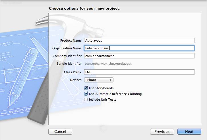
Create a new Xcode project using the single view application template. Set Devices to iPhone, Use Storyboards to On, and Use Automatic Reference Counting to On.
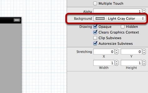
Open the MainStoryboard.storyboard file and change the background color of the view to light gray.

Add a Round Rect Button to the view horizontally centered near the top of the view. Notice the blue guide bar shown between the button and the top of the view? This is a vertical space constraint that describes the buttons position relative to the top of the superview. As you move the button near the top of the view you will notice that it snaps into position consistent with Apple’s iOS Human Interface Guidelines. If you select the constraint you can look at the attributes inspector to see the attributes set on the constraint.

If you move the button further away from the top you will notice that the Standard checkbox is no longer checked and the Constant displays the distance (in points) the button is from the superview. If you check the Standard checkbox you will see the button snap back into the HIG suggested standard spacing from the superview.

Add another button adjacent to the existing button. You will see that Interface Builder has created a spacing constraint between the buttons.
As you move the buttons around the view you will notice that the constraints automatically rebuilding based on their placement.
Up until now all of the constraints have been automatically created by the system, but you are free to create your own custom constraints. Position buttons so they are diagonal from each other. Now use the editor->align menu or the convenient buttons along the bottom of the Interface Builder view as in the screen shot to horizontally align the two buttons to each other by selecting Horizontal Centers. Notice that a new Center X Alignment constraint has been created. You will also notice that when you create your own constraints they are given blue icons, while the system created constraints are given purple icons. While a given element is selected you can use the Size Inspector to view a list of all constraints that describe its layout.
Constraints that cross the view hierarchy
You can get pretty far by setting up layout constraints in Interface Builder, but you might have a need to add constraints programatically. Constraints can be created in code like so:
[NSLayoutConstraint constraintWithItem: firstButton
            attribute: NSLayoutAttributeLeft
            relatedBy: NSLayoutRelationshipEquals
            toItem: secondButton
            attribute: NSLayoutAttributeRight
            multiplier: 1.0
            constant: 12];
A constraint that is created in your xibs and storyboards can be an IBOutlet. To illustrate this point you will need to make some changes to the user interface.
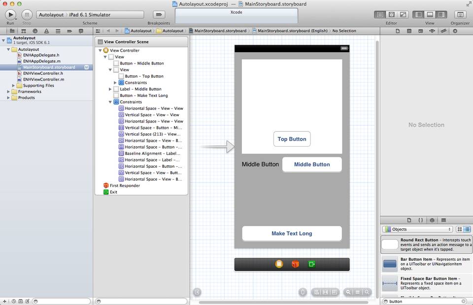
- Add a UIView to the interface that takes up about half of the top of the UI. This view will serve as a container view for one of our buttons.
- Move one of the UIButton items into the new container view centered near the bottom and change the label to Top Button.
- Add a UILabel and change the text to read Middle Button and position it below the container view.
- Change the text on the other button to read Middle Button and position it to the right of the Middle Button label.
- Add a new UIButton to the bottom of the interface labeled Make Long Text and stretch it to fill the HIG width guidelines.
You might want to align the center of the Top Button with the Middle Button. The way that the view hierarchy is currently setup you can’t create the centering layout constraint across the views in Interface Builder. If you select one of the buttons hosted directly by the grey view controller’s view, you will be unable to select and apply a constraint to the button that is contained in the white subview. Interface Builder will instead select the white view. Fortunately you can do this in code.
Here is a diagram of what you are about to do. First you are going to get a reference to the auto layout constraint that is keeping the top button centered in its superview.
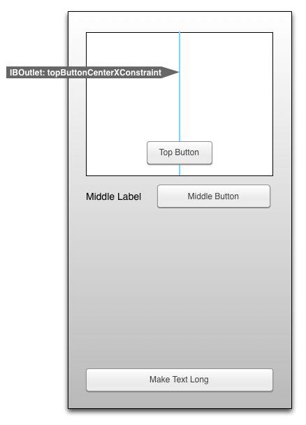
Then you will remove that constraint and add a new one to center the top button over the middle button’s position.
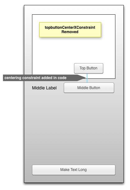
Add the following IBOutlet properties to the class extension of ENHViewController.m and wire them up to the corresponding elements in Interface Builder.
@interface ENHViewController ()

@property (weak, nonatomic) IBOutlet UIView *containerView;
@property (weak, nonatomic) IBOutlet NSLayoutConstraint *topButtonCenterXConstraint;
@property (weak, nonatomic) IBOutlet UIButton *topButton;
@property (weak, nonatomic) IBOutlet UIButton *middleButton;
@property (weak, nonatomic) IBOutlet UIButton *makeTextLongButton;

@end
Replace the boilerplate implementation of viewDidLoad implementation with the following:
- (void)viewDidLoad
{
    [super viewDidLoad];
    [self.topButton removeConstraint:self.topButtonCenterXConstraint];
    NSLayoutConstraint *constraint = [NSLayoutConstraint constraintWithItem:self.topButton
                                                                  attribute:NSLayoutAttributeCenterX
                                                                  relatedBy:NSLayoutRelationEqual
                                                                     toItem:self.middleButton
                                                                  attribute:NSLayoutAttributeCenterX
                                                                 multiplier:1.0f
                                                                   constant:1.0f];
    [self.topButton addConstraint:constraint];
}
In the method above you are attempting to remove the existing centering constraint that the system added to keep the top button centered in the container view. Next you create a new layout constraint that binds the horizontal centers of the top and middle buttons. Finally the constraint is added to the top button.
Build and run the app. It will crash with the following error message.

The system has helpfully hinted that you have installed a constraint on the wrong view.
In the implementation of viewDidLoad there is a common, but mistaken assumption that the constraints are added and removed from the button itself. In fact, the topButtonCenterXConstraint is added to the button’s superview. Open MainStoryboard.storyboard and select the vertical constraint to which you have connected the topButtonCenterXConstraint IBOutlet. Note that the constraint was actually added to the button’s superview.
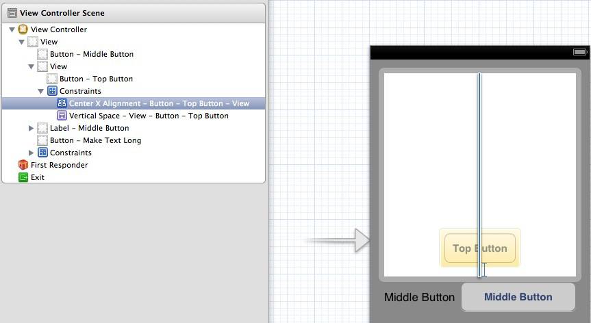
Why is this? When creating a constraint between two views, the constraint must be applied to the closest common ancestor of the two constrained views. In the case of the topButtonCenterXConstraint you wish to remove, that view is the white host view. Since it is attached to the host view, the constraint should have been removed from the tops button’s superview instead of the button itself. The new constraint should be added to a common ancestor of the buttons it is trying to constrain, the superview of the containerView, which is the grey view.
Replace the implementation of viewDidLoad in ENHViewController.m with the following:
- (void)viewDidLoad
{
    [super viewDidLoad];
    // Do any additional setup after loading the view, typically from a nib.

    [self.containerView removeConstraint:self.topButtonCenterXConstraint];
    NSLayoutConstraint *constraint = [NSLayoutConstraint constraintWithItem:self.topButton
                                                                  attribute:NSLayoutAttributeCenterX
                                                                  relatedBy:NSLayoutRelationEqual
                                                                     toItem:self.middleButton
                                                                  attribute:NSLayoutAttributeCenterX
                                                                 multiplier:1.0f
                                                                   constant:1.0f];
    [self.view addConstraint:constraint];
}
Build and run the application. You should now see the top button centered above the middle button.

Priorities
Constraints also have relative priorities associated with them. This allows constraints to be flexible, so they can adapt to the views content. If it’s more important to you for a certain view to maintain a minimum size than for another, you can set this relative priority in constraints. To see this in practice add an IBOutlet for the middle label to the class extension:
@property (weak, nonatomic) IBOutlet UILabel *middleLabel;
Now wire up the following IBAction to the button labeled Make Text Long:
- (IBAction)makeTextLongButtonTapped:(id)sender
{
    [self.middleLabel setText:@"Hello Long World:"];
}
Build and run the application. Tap the Make Text Long button and you will see the text label change and become truncated.
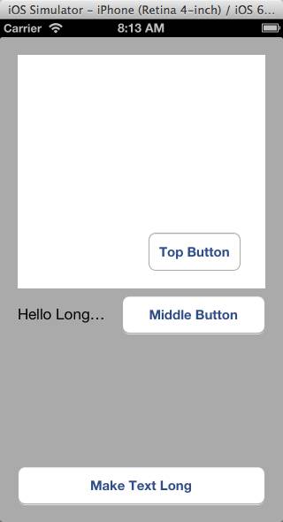
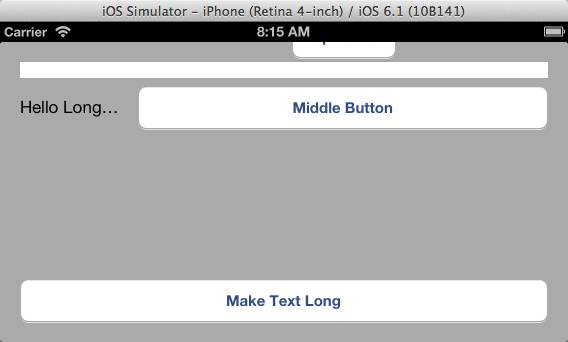
If you rotate the simulator 90 degrees to landscape mode you will see that the UI becomes somewhat mangled.
In Interface Builder select the Middle Label, navigate to the size inspector and raise the Horizontal Content Hugging Priority value to 700. Content hugging is the priority with which a view resists being made larger than its intrinsic size.
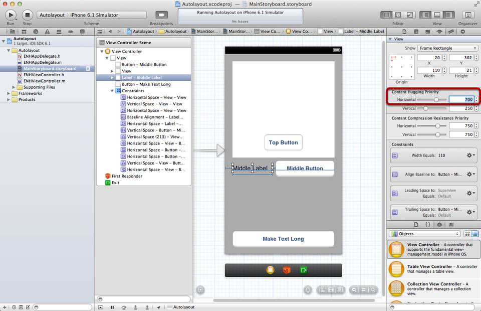
Select the Middle Button and set the Horizontal Content Compression Resistance value to 100. Content compression Resistance is the priority with which a view resists being made smaller than its intrinsic size.
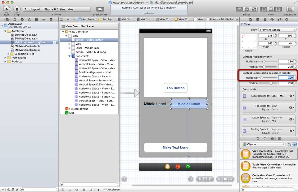
This combination of content hugging and compression resistance settings will allow your button to make room for the expanding label’s contents.
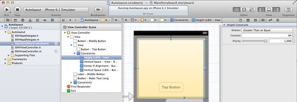
Select the top container view and add a new height constraint. Set the Relation to Greater Than ot Equal and the Constant to 84. We’ve chosen 84 as the constant since our button is 44 points tall and we want to kee 20 points of padding above and below the Top Button. This will allow the top container view to reduce in height as needed when the device is in landscape orientation.
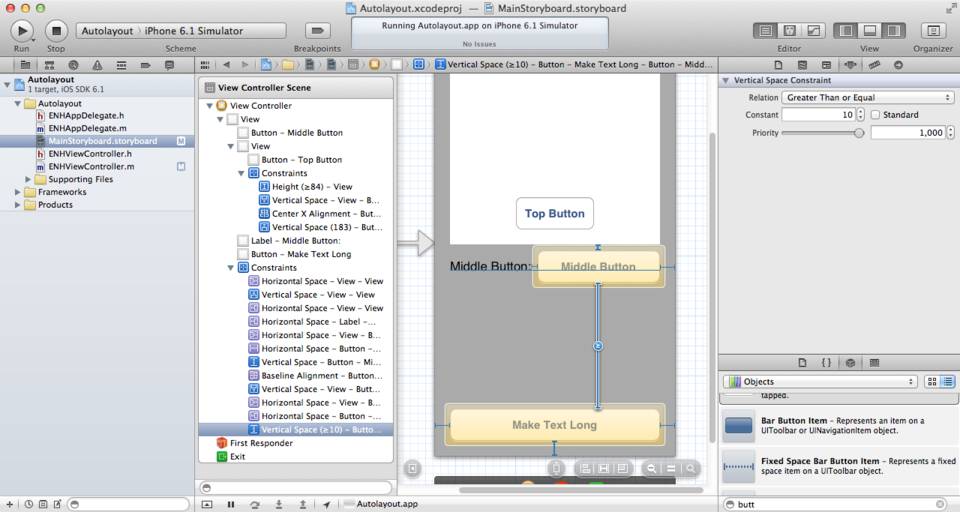
Select the Middle Button and the Make Text Long button and create a new Vertical Spacing constraint between the two. Select the constraint and set the Relation to Greater Than or Equal and the constant to 10. This will allow the space between the buttons to flex as the device is rotated.
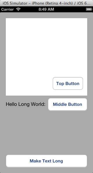
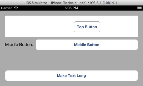
Build and run the application. Notice that when you tap the Make Text Long button the UI automatically adjusts to accommodate the content. Also notice that the two buttons are still have their centering constraints intact. Rotate the device to make sure the UI adjusts to keep the containerview and the top button on the screen.
Frame Rect vs. Alignment Rect vs. Content Rect vs. intrinsic size
Automatically laying out views on screen is more complicated than simply calculating their frame rectangles. You may have written layout code in the past that has found the drawn rectangle of a given string to figure out how to size views relative to a UILabel. Views will often have a frame that is larger than their drawn contents. How does auto layout know the visual content size of views on the screen for layout? A couple of factors come into play.
Each view has an intrinsicContentSize property that subclasses of UIView can override to let auto layout know of the size of their internal content. This value along with the view’s content hugging and content compression resistance properties allows auto layout to decide how to stretch and shrink views depending the “stuff inside”. Views with a high content hugging priority will tend to stay close to their intrinsic content size. Views with a high content compression resistance priority will resist shrinking below their intrinsic content size as when a UILabel or UIButton begins truncating or clipping its contained text.

Each view may also override its alignmentRectInsets property. This lets auto layout know that some portion of the view’s content is ornamental and should not be used for purposes of aligning the view to other views. If a view has an ornamental badge, for instance, it would return alignmentRectInsets that tell auto layout to ignore the badge for alignment. The view maintains an intrinsic content size that includes the badge, so that auto layout knows not to draw other views in the area where the badge is drawn.

Y’all come back now, y’hear?
In this tutorial you learned the basics of auto layout. You created a basic view layout in Interface Builder and how to create some basic layout constraints there. Then you ventured into code to remove and then add a constraint that Interface Builder could not provide. In our next auto layout installment, you will learn more about creating constraints in code using the powerful ASCII art visual format language. You will also learn how to animate constraints using Grand Central Dispatch.
Stay tuned!
One thought on “Tutorial: Auto Layout Part 1”
May 18, 2015 at 10:51 pm
[…] Tutorial: Auto Layout Part 1 […]